logo

Database Console

Type

Case Study

Company

Skuid

Role

Lead Product Designer

Duration

Duration

Background

Skuid NLX began as a low-code application development platform for building tailor-made experiences that leverage data and services customers already use. Skuid NLX didn’t have any sort of database included in the product, but instead relied on connecting to existing customer data sources (primarily SQL databases and REST APIs) to hydrate applications with data.

What is Database Console?

Skuid NLX has a new managed database feature and Database Console is the dedicated workspace for creating and configuring the database tables, fields, and access rules.

Why did we add a database?

Usually the features I work on can be directly tied to user stories, but in this case, the primary impetus for adding a database was strategic. The low-code space is still being defined in many ways, but one thing is clear: products without a managed database are considered ‘tools’, not ‘platforms’. If Skuid ever wanted to make it onto the Gartner Magic Quadrant with other top low-code application platforms, we were going to need to provide a database, and there was a strong push from company leadership to do that.

Greenfield ambiguity

Adding features as a foundation for long-term strategy can make sense (dress for the job you want, right?), but we didn't have a very clear near to mid-term vision of what this thing should be and how it should serve our users while we work that long-term goal. Brand new features are hard enough to design with high quality data and definition, but this project had a lot of ambiguity from the start.

At many points along the journey to release I remember feeling uncomfortable––unsure how to validate what felt like a pile of assumptions we were building our feature on. Who was this for? What was this for? We had guesses and hunches, but ultimately we were building this feature to have it for future endeavors, not to solve an immediate problem in a measurable way.

To avoid total paralysis, we had to make some educated assumptions about our target users and their stories, document the risk of being wrong, and move forward.

The problem we decided to solve

Our product was really good at helping users build apps on top of their existing business systems. However, we couldn’t offer much to users who had a great idea for an app but no existing system to connect to. Enter Skuid’s new managed database. So, this is the 'meta' user story that our team held in our minds from design to release:
Story
As a Skuid app builder, I want to be able to easily build out the database for my new app so that I don’t have to use IT resources to get my app off the ground.

New problem

Skuid’s primary user personas, however, are not database administrators or architects; they’re front-end developers, business system administrators and business analysts. We needed to design our experience in a way that would be approachable for our users––technically minded but likely without experience building databases.

Competitor analysis

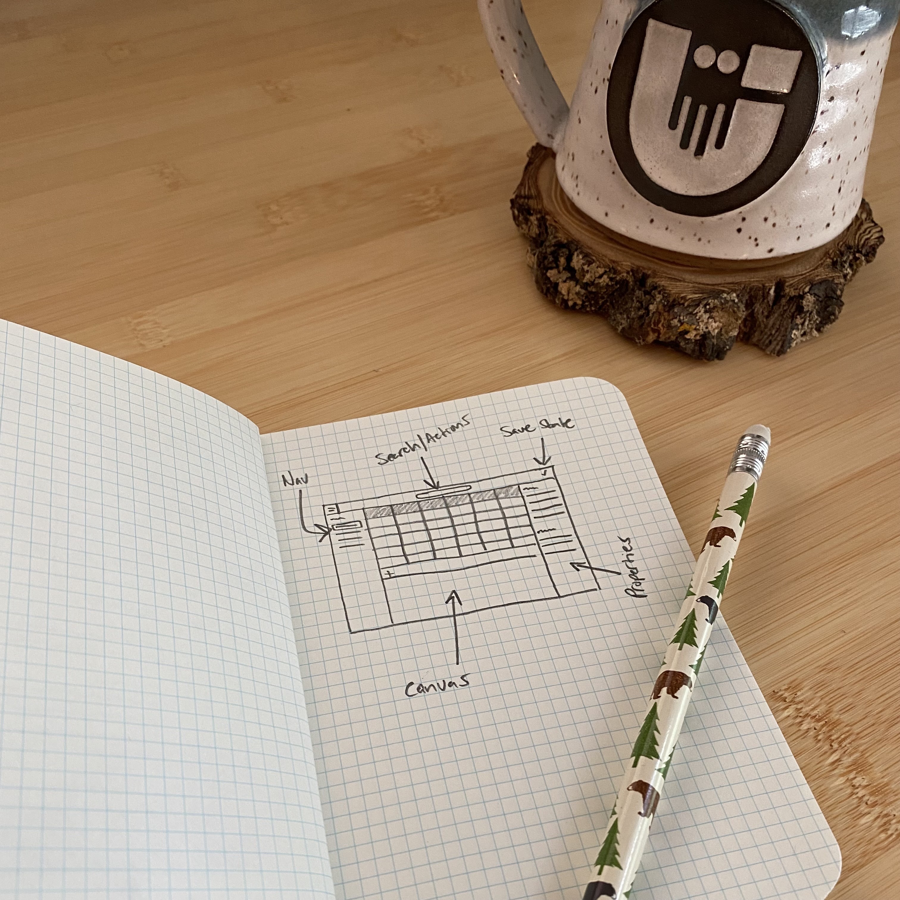
I’m a firm believer in Jakob’s Law, so I spent a lot of time building out sample apps and schema in similar products with similar user personas, like Airtable, Bubble and 
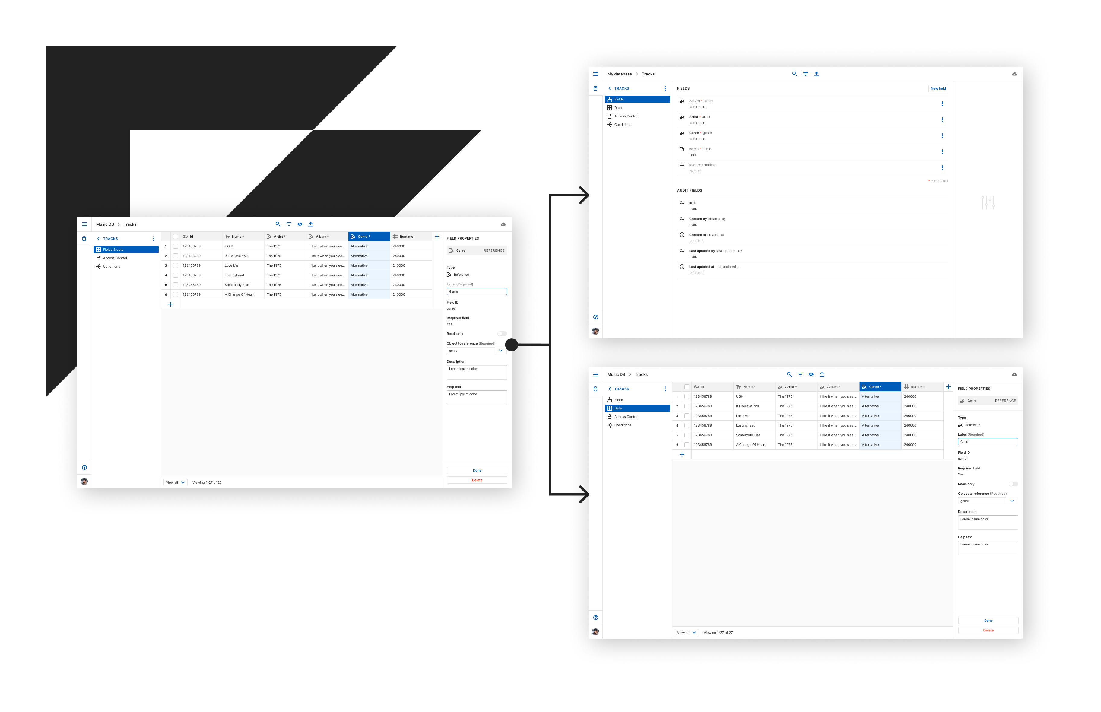
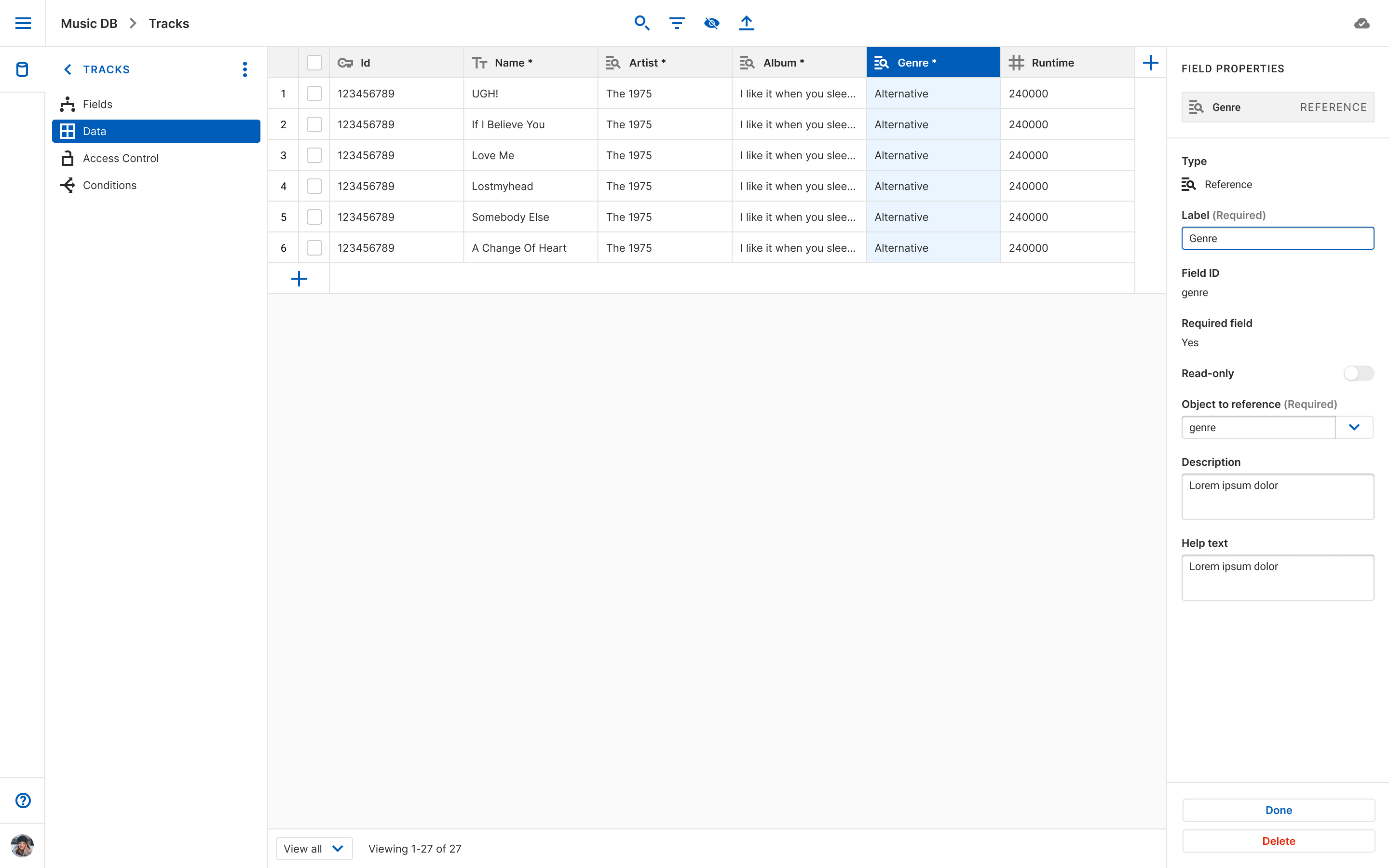
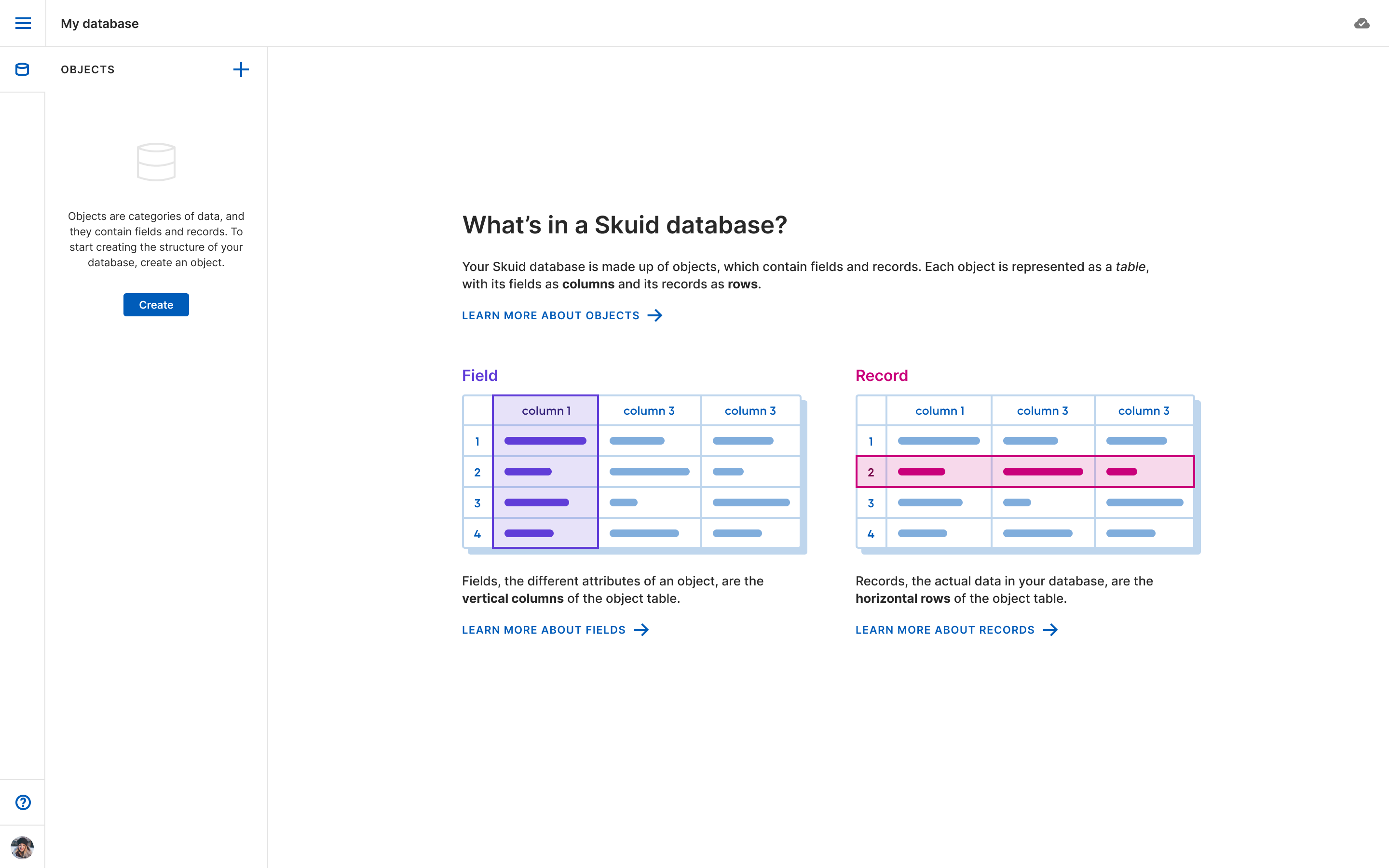
Salesforce, trying to identify common design patterns. I found that almost every other product used the familiar design pattern of a spreadsheet to communicate the way that database tables––or objects, or entities––are structured. Additionally, many SQL field types that non-database folk may not recognize, like ‘float’ and ‘double’, were renamed with more user-friendly labels like ‘number’. And some new, non-standard field types were created for users to account for common use cases: email, phone number, multi-select, etc.

My PM and I conducted user interviews to learn if these things that were common amongst similar products might work for our users as well. The consensus was that our users liked these patterns when they had encountered them elsewhere, and even felt empowered by them. Combined with validation of knowing that other top products in our space were using a similar approach, this gave us enough confidence to move forward with the following hypothesis:
Hypothesis
By using a data grid pattern with familiar field types as the primary UI for field and record creation on database tables, users without previous experience building databases will be able to build out the necessary schema to support their applications with little to no training.

Quick to high fidelity

I began designing the UI, and in usual fashion sketches turned to wireframes turned to high-fidelity mockups turned to clickable prototypes. On this particular project I found myself moving to high-fidelity designs quickly in order to effectively communicate the intricacies of the subject matter. (Turns out database design is just a smidge complex.)
Clickable prototypes were incredibly helpful when it came to communicating the various states of things like autosave and data grid interactions. Here’s just one example of a simple prototype I used to explain to an engineer the desired behavior of placeholder text and required-field indicators in table cells.
Expand to full screen for best experience
The data grid pattern itself demanded a lot of attention to detail. While we had similar tabular patterns in our design system already, this would need to be a brand new component with spreadsheet-like interactions. Those interactions and states needed to be defined for all possible database field types.
Expand to full screen for best experience

Testing

We followed up with our interview participants and conducted iterative usability tests to understand how well our design met their needs. Early on, we used clickable prototypes, and continued to test throughout the design process as our questions increased in complexity and prototypes increased in fidelity.
Testing seemed to validate our hypothesis that non-database experts could easily understand and use our feature to build out a proper database for their apps. Participants were generally able to complete the tasks we gave them without much hesitation. Testing also helped us uncover bugs and small issues of design clarity.

One exciting insight that came out of testing was that we needed a dedicated view for creating and managing fields. While users would still be able to edit and create new fields from the ‘Data’ view as well, that became a more advanced, secondary action to data entry in that view. We had overwhelmingly positive feedback around the change.

Impact

In Q1 2022, Skuid’s managed database and Database Console were released in a closed beta. Feedback from participating customers and partners primarily uncovered some small bugs and minor performance issues, but overall feedback has been positive. A round of enhancements were made to address the feedback and as of Q2 2022, the feature is in open beta. Now, we are attempting to study the way customers are using the managed database so that we can understand if this new product adds value in the ways we hypothesized it would and to learn ways we might improve and tailor the experience to their use cases.

final

logo